Plana
Co-founded and designed a business planning SaaS from paper prototype to production product, trialled at university.
Role
Co-founder, PM, UX Designer & Researcher
Duration
1 year
Tools
Figma, Sketch, Zeplin, Trello
The Outcome
Co-founded a SaaS product from paper to production
Plana is a business planning web application that I co-founded and designed. I took a working paper-based product and designed the full digital experience — from initial research through to a production product that was trialled at a university. I served as co-founder, project manager, UX designer, and UX researcher. I later exited to focus on other projects.
The product solved a real problem: existing business planning tools were heavily templated, designed for businesses rather than consultants, and focused on creating a plan — not the collaborative process of building one. Plana was different: it guided users through a structured planning process with real-time collaboration between consultants and business owners.
Research
Understanding the market and users
Secondary research
Initial research explored how businesses and consultants feel about using software to create business plans. Key findings:
The majority of solutions were heavily templated
Nearly all were designed for the business, not consultants
Most focused on creating a plan, not maintaining it
None focused on the process of creating a plan, only the result
Primary research — four key findings
I conducted user interviews and created an affinity diagram. The findings shaped every design decision:
Consultants value their time and efficiency
Time is money — tools must help, not slow them down.
Consultants value structure to easily price their time
Structured planning lets consultants scope and bill accurately.
Businesses don't see the real benefit of a business plan
The output feels abstract — they need to see practical value.
Businesses feel they need help but struggle getting it
They know they need guidance but finding the right support is hard.
Two Personas
A consultant and a business owner with different but interconnected goals
The research revealed two distinct user types — a consultant (“Sarah”) who needed efficiency and structure, and a business owner (“Robb”) who needed confidence and guidance. Every design decision needed to serve both.
Information Architecture
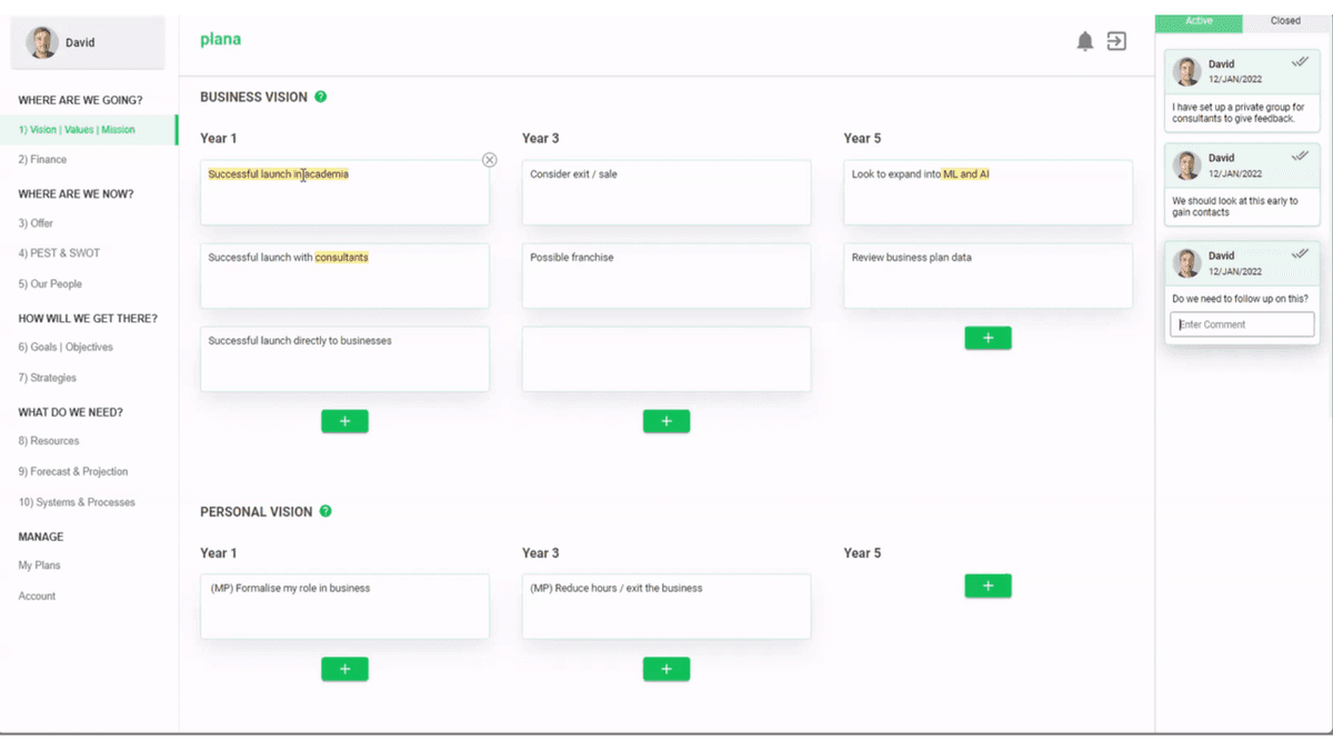
Structuring a 10-section business plan into a navigable flow
A business plan contains deeply interconnected sections — vision feeds into goals, goals feed into strategies, strategies need resources and financial projections. I organised the IA around four natural questions: Where are we going? Where are we now? How will we get there? What do we need? This gave users a mental model for navigating complex content.
Ideation
Three “How Might We” questions
How might we help the business feel confident and comfortable, to be more involved in the planning process?
How might we create an environment that makes collaboration on a business plan feel easy and natural?
How might we help consultants be efficient and not waste time on communication and admin?
Design Evolution
From paper sketches to production — four design phases
1. Paper sketches and low-fidelity wireframes
I started with paper sketches, then created low-fidelity wireframes for each of the 10 sections. These wireframes explored how to present complex business planning concepts — financial measures, PEST/SWOT analysis, vision cascades, and organisational structures — in a way that felt approachable rather than overwhelming.
2. Mid-fidelity designs with collaboration features
The mid-fidelity phase introduced the collaboration layer — commenting, review requests, section explanations, and time tracking. This was where the two-persona challenge became real: consultants needed efficiency features (time tracking, key points), while business owners needed guidance (explain section, view examples).
3. High-fidelity prototypes
High-fidelity designs refined each section. The product evolved from a top-navigation pagination model to a sidebar navigation — a direct result of usability testing that revealed users couldn't browse sections efficiently with the original approach.
4. Final production design
The production design brought everything together — sidebar navigation, structured content areas, real-time commenting with threaded replies, and a clean visual system. The design served both desktop and mobile, with the mobile experience prioritising business owners who needed to review and comment on the go.
Usability Testing
Testing with real users, iterating on real feedback
I built prototypes for usability testing with financial consultants and businesses — both in-person and remote. Testing revealed six key issues that directly shaped the design:
Navigation moved to the side
Top pagination frustrated users who needed to browse sections. Titles added after further tests.
Help icon repositioned
Moved next to headings in the primary colour. Help articles split into smaller pieces after further testing.
Text highlighting made brighter
Users missed comment indicators on highlighted text.
Branding colour changed
Based on direct user feedback.
Comment completion added
Comments can now be ticked off as complete, moving to a separate tab.
Active comment clarified
Shadow and animation added to show which comment is currently selected.
Responsive Design
Designing for business owners on the go
Business owners needed to review plans and respond to comments from their phones. The mobile experience prioritised reading, commenting, and reviewing — with the full editing experience reserved for desktop where consultants typically worked.
The Outcome
From concept to university trial
Plana went from a paper-based product to a fully designed and built web application. The product was trialled with 12 consultants and their clients through a university incubator programme, achieving an 85% first-use task completion rate during moderated testing.
I successfully exited after the trial — the product continued development under new team leadership. The core hypothesis was validated: consultants and business owners need shared tooling, not separate templates.
The experience of co-founding a product — wearing every hat from research to production — shaped how I approach design: always grounded in real user research, always thinking about the full product, not just individual screens.